

Thread
Theme: FatalE Released! (v0.9)
The official FatalE port is finally ready for a public beating! I've posted version 0.9, as it is not yet a polished theme. Either way, I hope you guys still enjoy this theme as much as I do. Thanks again to KoL for granting me permission to do the OS X port of his FatalE visual style for Windows -- it's truly a beautiful design regardless of which side of the fence it was born on 
Download page:
http://www.621.org/~carbon/
Preview:
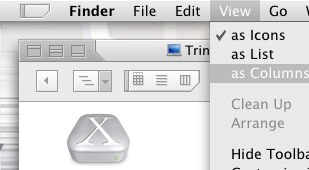
Enjoy!
-Carbon
Download page:
http://www.621.org/~carbon/
Preview:
Enjoy!
-Carbon
absolutely fantastic! looks f-ing great!! Thanks!
Nice as hell!!! Thanks!
Cool theme... Thanks
I'm very impressed! It shows a cohesiveness and polish that few themes have.
Thanks!
Thanks!
Carbon, can you fix this, or no?
also, the scroll bar doesn't seem to go all the way up to the box, was it supposed to be like that?
also, the scroll bar doesn't seem to go all the way up to the box, was it supposed to be like that?
great job on the port Carbon 
Im gonna update my site with the news
Im gonna update my site with the news
Gorgeous! Just a gorgeous theme!
Kudos to you Carbon and KoL for the port and design...This is one really cool looking theme. Looks like I'll be using this for quite some time now.
2
4
Kudos to you Carbon and KoL for the port and design...This is one really cool looking theme. Looks like I'll be using this for quite some time now.
2
4
also, if a window is really small, i can't seem to grab & drag the scroll bar
Thanks for the feedback guys, glad to hear it wasn't a disappointment. In response to the titlebar issue brought up by iRebound, that's not really my fault and there isn't anything I can do about it... it's a limitation in the OS. The same truncation and overlapping of the titlebar will happen in any theme that has end caps, such as AlumiteX and ChosenOS -- an this theme is certainly no exception. As for the minor scrollbar issue, that was one I was aware of before but I'm not sure what the best method for resolving it is yet, I will try to talk with either Swiz or Max about it when I have some more free time to plug away at the bugs in FatalE before releasing 1.0.
Thanks again and enjoy the theme!
-Carbon
Thanks again and enjoy the theme!
-Carbon
Looks good Carbon. I'll start testing it out on Monday when I'm back at my ofice computer.
I am really enjoying the theme but the scrollbar confuses me. I have the tendency to grab the white part of the scrollbar. this may be due to the fact that I have been using Max's Milk theme for ages....
I have the same problem with the scroll bars, because I was using the Milk theme for so long!
I have one request (as futile as it may seem)... If the menu bar could have more of a gradient, more of a light-to-dark thing, its a little dark for my taste...what a strange request, I know, but the reast of the theme is awesome.
I'd try to do it myself if i had any idea what the menu bar's resources are.
Thanks for an awesome theme!
I have one request (as futile as it may seem)... If the menu bar could have more of a gradient, more of a light-to-dark thing, its a little dark for my taste...what a strange request, I know, but the reast of the theme is awesome.
I'd try to do it myself if i had any idea what the menu bar's resources are.
Thanks for an awesome theme!
maybe you can add a little dept in the scroll bar so people won't get confused
After I finish and release FatalE 1.0 I plan to do at least one or two color variations because it shouldn't require nearly as much work as a new theme, which means it should be doable between my schedule over the next couple of months. That is, providing that KoL is still okay with me doing color variant(s)... I've been playing around with the deep blue varaint:

It's not KoL's exact deep blue because I haven't requested the source files yet, but if my memory serves me correct my mockup should be fairly close to his deep blue (but maybe not, heh).
What I want to know is if there is even enough interest in this, or if I'm wasting my time... and I may do a second variant as well, depending on which other color is requested the most here.
It's not KoL's exact deep blue because I haven't requested the source files yet, but if my memory serves me correct my mockup should be fairly close to his deep blue (but maybe not, heh).
What I want to know is if there is even enough interest in this, or if I'm wasting my time... and I may do a second variant as well, depending on which other color is requested the most here.
i love this theme. i just wanted to try it out and now i'm using it since two days. this theme is simple and yet it is sexy.
there are just two things which i dont like: the scrollbars look too busy imo (the up and down-buttons with those two dark-gray bars above and under them) and as already said i sometimes dont know whether to grab the light or the dark-grey are of the bar.
and i think the small palette-windows should be improved.
ah, yes, one more thing: the drawers still look aqua-like to me...
really good work, thanks a lot for this theme, carbon and KoL
// phil
there are just two things which i dont like: the scrollbars look too busy imo (the up and down-buttons with those two dark-gray bars above and under them) and as already said i sometimes dont know whether to grab the light or the dark-grey are of the bar.
and i think the small palette-windows should be improved.
ah, yes, one more thing: the drawers still look aqua-like to me...
really good work, thanks a lot for this theme, carbon and KoL
// phil
i love the blue. for another color variation i think you should choose red...because there arent many red themes out for mac. keep up the good work
Quote:
|
Originally posted by CarbonG4: After I finish and release FatalE 1.0 I plan to do at least one or two color variations because it shouldn't require nearly as much work as a new theme, which means it should be doable between my schedule over the next couple of months. That is, providing that KoL is still okay with me doing color variant(s)... I've been playing around with the deep blue varaint: It's not KoL's exact deep blue because I haven't requested the source files yet, but if my memory serves me correct my mockup should be fairly close to his deep blue (but maybe not, heh). What I want to know is if there is even enough interest in this, or if I'm wasting my time... and I may do a second variant as well, depending on which other color is requested the most here. |
I really like that blue, but make the window widgets grey set in the blue endcap!
The blue looks OK to me...but, I would love to see a red version.
stndrddc is right...there aren't that many red themes out there for OS X and this one would be really great in red, IMO.
I also really liked the black version as well.
2
4
stndrddc is right...there aren't that many red themes out there for OS X and this one would be really great in red, IMO.
I also really liked the black version as well.
2
4
Yes! Please make a black variant.
Make black is the new Aqua on OSX
Make black is the new Aqua on OSX
nice Carbon
if you want the other variations I can send you all the images
mail me kol@designtechnika.com
if you want the other variations I can send you all the images
mail me kol@designtechnika.com
The blue variation looks awesome.
I just downloaded this theme but have no clue how to install it!! Can somebody please help me??
thanks
(its so easy isn't it?? i know it is!)
thanks
(its so easy isn't it?? i know it is!)
Do you have ThemeChanger or Duality? You need a theme installer.. Try either...
It is really simple. They should guide you through the steps.
It is really simple. They should guide you through the steps.