

Thread
Theme: FatalE Black Edition
Well I had some extra time today and KoL sent me the source files for the other color variants of FatalE... so I cranked out the Black variant today. FatalE v0.91:
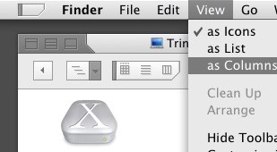
Theme page: http://www.621.org/~carbon/
Enjoy
-Carbon
Theme page: http://www.621.org/~carbon/
Enjoy
-Carbon
Very nice theme!
The new black version is my fav. for the moment. I like the subtility of it!
My only beef is the apple menu. Is there a way to keek it a simple apple?
The new black version is my fav. for the moment. I like the subtility of it!
My only beef is the apple menu. Is there a way to keek it a simple apple?
Where's the colour black 
Dace: this is virtually an exact match to KoL's original FatalE Black visual style... it was obviously meant to be more of a charcoal color.
-Carbon
-Carbon
Quote:
|
Originally posted by CarbonG4: Dace: this is virtually an exact match to KoL's original FatalE Black visual style... it was obviously meant to be more of a charcoal color. -Carbon |
Any chance of a true black version?

Not as black as I expected... but very nice! I mean, it would look horrid if it were a truely deep black, so I guess this is the best color choice.
I'm trying to decide which version of the theme looks best on a titanium powerbook to match its looks...
Other FatalE observations:
- It has the best tabs ever
- Apple menu is not my style, I would rather have a themed apple logo
- Scrolls don't look quite right, I get confused at times if the bar is active or inactive...
Still, its really nice and seeing as how I have 0 themes available, I can't complain too much!
I'm trying to decide which version of the theme looks best on a titanium powerbook to match its looks...
Other FatalE observations:
- It has the best tabs ever
- Apple menu is not my style, I would rather have a themed apple logo
- Scrolls don't look quite right, I get confused at times if the bar is active or inactive...
Still, its really nice and seeing as how I have 0 themes available, I can't complain too much!
SwarmyCurve, heh I'm torn between the two as well... I think the black looks best with the Titanium but I'll probably be moving back to silver before long, after all it's the version I fell in love with to begin with.
I think I'll go ahead and add a traditional Apple Menu in a future build as an option (when you choose "graphite" in the System Prefs > General)... seeing as I ended up having to do the same thing with Watercolor I should know by now to at least have one normal Apple logo in my themes
I think I'll go ahead and add a traditional Apple Menu in a future build as an option (when you choose "graphite" in the System Prefs > General)... seeing as I ended up having to do the same thing with Watercolor I should know by now to at least have one normal Apple logo in my themes
This is great!
I love them both! I can't say which looks better...They're both great looking!
2
4
I love them both! I can't say which looks better...They're both great looking!
2
4
I'm in complete agreement with SwarmyCurve, but I found that after installing the black version, the finder buttons are back to the aqua version. Anyone agree?
Quote:
|
Originally posted by Stuphalina: I'm in complete agreement with SwarmyCurve, but I found that after installing the black version, the finder buttons are back to the aqua version. Anyone agree? |
Personally, I use ThemeChanger, which switches back to Aqua automatically before applying a new theme.
Quote:
|
Originally posted by CarbonG4: SwarmyCurve, heh I'm torn between the two as well... I think the black looks best with the Titanium but I'll probably be moving back to silver before long, after all it's the version I fell in love with to begin with. I think I'll go ahead and add a traditional Apple Menu in a future build as an option (when you choose "graphite" in the System Prefs > General)... seeing as I ended up having to do the same thing with Watercolor I should know by now to at least have one normal Apple logo in my themes
|
Hey, is there anyway you could modify the scrollbars a tad? They don't touch the bottom right now and I always feel like the window isn't letting me see the last couple of items.
Very tight..nice work!!
I added a FatalE inspired deesktop background to go along with the folder icons I made. You can get it here: http://icons.wagmedia.com
Hay a B&W negative theme might look cool! I don't know why I just though of that though...
Well it's a nice theme, but it's a bit too Windows looking for me.
Well it's a nice theme, but it's a bit too Windows looking for me.
great wallpaper wagmedia
@ NetworkShadow: hmm thats a nice idea. I think I'll try that, Thanks
@ NetworkShadow: hmm thats a nice idea. I think I'll try that, Thanks
Thanks. I was thinking about offering a more muted version as well. Any takers?