
Thread
SmoothStripes 2.5 released!
This is the news:
- Updated the x-+ buttons to jaguar style, both regular and metal. Thanks to Synotic for suggesting this.
- Updated progressbars to jaguar style. Also updated the bootpanel progressbar.
- Added a Gloss variation. Thanks to Rene for his suggestions, help and inspiration on this. Also thanks to Terrence Scoville for inspiration.
- Added jaguar style scrolls, both large and small. Also changed the scroll arrows a bit.
- Updated login panel buttons into jaguar style.
- Fixed some buttons in the Finder search windows that had mixed up colors (Apples fault..).
- Removed the two SmoothStripes variation with transparent inactive titlebars and opaque menus.
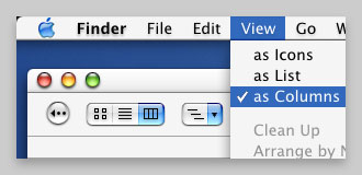
Get it from my homepage:
Max Themes
- Updated the x-+ buttons to jaguar style, both regular and metal. Thanks to Synotic for suggesting this.
- Updated progressbars to jaguar style. Also updated the bootpanel progressbar.
- Added a Gloss variation. Thanks to Rene for his suggestions, help and inspiration on this. Also thanks to Terrence Scoville for inspiration.
- Added jaguar style scrolls, both large and small. Also changed the scroll arrows a bit.
- Updated login panel buttons into jaguar style.
- Fixed some buttons in the Finder search windows that had mixed up colors (Apples fault..).
- Removed the two SmoothStripes variation with transparent inactive titlebars and opaque menus.
Get it from my homepage:
Max Themes
Glossy looks sooo nice... mmmmm aqualicious. Downloading now.
Quote:
|
Originally posted by phillryu: Glossy looks sooo nice... mmmmm aqualicious. Downloading now. |
looks absolutely sweet... but when i'm trying to download i get a file not found-error :-(
// phil
hmm...im getting an error too....
looks great though
looks great though
Remove the ".dmg" so it just reads "smoothstripes.sit" and I downloaded it. He'll fix it soon enough, I'm sure.
And beautiful work, Max! I've used lots of your themes. Very nice.
And beautiful work, Max! I've used lots of your themes. Very nice.
Quote:
|
Originally posted by p.h..i...l....: looks absolutely sweet... but when i'm trying to download i get a file not found-error :-( // phil |
Argh! I was just about to go to sleep. The correct link is here!
Sorry about that..

The download link does not work!
WOW...now those x - + widgets look muuuuuuch better. Max, Apple should be paying you for all the great improvements you've given Aqua. I still think they imitated your idea for sunken widgets in brushed apps  Great theme.
Perfection.
Schweet! 
Downloading iFix 2 as well,
which looks awesome.
Downloading iFix 2 as well,
which looks awesome.
Quote:
|
Originally posted by bOOzo: Argh! I was just about to go to sleep. The correct link is here! Sorry about that..
|
cool, thanx... and sorry for keeping you awake ;-)
// phil
fantastic work, but thats nothing new with you.
i got a question tho... have you ever thought about taking the things you have done to smooth stripes and applying them to aqua was lazy? i know you did aqua square, but what about the inset widget buttons and the other stufff?
i got a question tho... have you ever thought about taking the things you have done to smooth stripes and applying them to aqua was lazy? i know you did aqua square, but what about the inset widget buttons and the other stufff?
When you wake up, could you consider adding another variation for next version with the menu highlights in glossy a bit darker? They're a little too bright for my tastes right now; something midway between aqua's dark blue and glossy's bright sky blue would be perfect.
Amazing! Wonderful! Perfect!
Looks stunning, just what I was dreaming of. You have raised the bar yet again! The iTunes/QuickTime fix with Happicon looks great too, finally makes QuickTime appear modern.
Looks stunning, just what I was dreaming of. You have raised the bar yet again! The iTunes/QuickTime fix with Happicon looks great too, finally makes QuickTime appear modern.
how would i go about taking "brushed" out of this theme? without using Metallifizer, it adds a title bar and looks funny.
Wow! Job well done Max.
"Also thanks to Terrence Scoville for inspiration."
Thanks for the recognition!
Thanks for the recognition!
Yeah Max this is a great upgrade to Aqua. I am fond of the glossy, opaque, rounded variation especially. I only have to suggestions, I don't like the gloss as it is applied to menu selections, it looks kind of like if someone were trying to make OS9 feel as much like Aqua as they could and going a bit overboard, I REALLY like the sunken widgets mega RAD. I'd like to see the push buttons, popup buttons and tabs sunken in this manner as well... any chance??? Great work as usual bro.
Does it have a graphite look too?
Quote:
|
Originally posted by SwarmyCurve: Amazing! Wonderful! Perfect! Looks stunning, just what I was dreaming of. You have raised the bar yet again! The iTunes/QuickTime fix with Happicon looks great too, finally makes QuickTime appear modern. |
Ditto to every word! I was going to post the same.
Once again, thanks Max for your great work. Your themes, and attention to GUI details are really a great contribution to the Mac comunity.
Aqua, QuickTime and iTunes looks so much better now! Apple should pay attention.
Quote:
|
Originally posted by swiz: Yeah Max this is a great upgrade to Aqua. I am fond of the glossy, opaque, rounded variation especially. |
Is there a glossy opaque version??
I only have Glossy rounded and square, both with translucent background windows.
Quote:
|
Originally posted by Kujo: how would i go about taking "brushed" out of this theme? without using Metallifizer, it adds a title bar and looks funny. |
i second this, this theme would be amazing with the brushed metal smoothed out as well. i just switched from milk to this and i miss my silky-smooth safari..
- - - - -
http://n8x.vze.com

I just downloaded it, and I must say I like it a lot for an Aqua theme. I don't know how like it will be till I go back to BBX though...
Yea, I would like to see the glossy version with the brushed apps smoothed over too like with Milk. I'm using Metalifizer and Safari just doesn't look right with a titlebar.
Quote:
|
Originally posted by swiz: I REALLY like the sunken widgets mega RAD. I'd like to see the push buttons, popup buttons and tabs sunken in this manner as well... any chance??? Great work as usual bro. |
sunken widgets are the kewlest thing around right now.. can we get a opaque non-shinny version?
I'm using De-Metallifizer. I really don't like the brushed look anymore. Got old after iTunes.
Quote:
|
Originally posted by ARENA: Is there a glossy opaque version?? I only have Glossy rounded and square, both with translucent background windows. |
My bad ARENA, it is not opaque.
My favorite theme just keeps getting better!
Hey Max,
Nice work and excellent attention to detail. One small thing (and it's really no big deal): ThemeChanger reports the SmoothStripes version number as 2.1, not 2.5. I figured you might have missed this somewhere along the way.
HorseyBoy
Nice work and excellent attention to detail. One small thing (and it's really no big deal): ThemeChanger reports the SmoothStripes version number as 2.1, not 2.5. I figured you might have missed this somewhere along the way.
HorseyBoy
this is my favorite theme too. i always switch back to this after i tried a new theme. great job max!
with the combination of smoothstripes gloss and the snow e 2 aqua icons. aqua is even more yummie now. lickable!
btw, smoothstripes still say v2.1 in themechanger
with the combination of smoothstripes gloss and the snow e 2 aqua icons. aqua is even more yummie now.
lickable!btw, smoothstripes still say v2.1 in themechanger
Good morning *yawn*
Thanks for the response!
I will try to answer all of it.
Yes, I have thought about it now that i have made so many changes. I probably will make a Apple is lazy package with the new aqua stuff and two variations. One with rounded corners and one with squared. Perhaps also opaque versions.
I will see what I can do. The thing is though, I can't have to many variations of the theme as that will make it too large download and it will be slow to load in theme switchers.
Yeah, I forgot to change that.. Thanks for pointing it out.
There is no Glosss opaque, no. I thought about making one, but I don't know how many would like to have it?
I will see what I can do for the next release.
Sure, no problem. You deserve it.
The menu item fill might be wrong, you are right. But it looked out of place with a flat blue though. I will think about it.
Sunken pushbuttons? That would ba alot of work, but perhaps in a later version.
Of course, all my themes do and SmoothStripes is no exception.
Thanks for the response!
I will try to answer all of it.
Quote:
| i got a question tho... have you ever thought about taking the things you have done to smooth stripes and applying them to aqua was lazy? i know you did aqua square, but what about the inset widget buttons and the other stufff? |
Yes, I have thought about it now that i have made so many changes. I probably will make a Apple is lazy package with the new aqua stuff and two variations. One with rounded corners and one with squared. Perhaps also opaque versions.
Quote:
| this theme would be amazing with the brushed metal smoothed out as well. i just switched from milk to this and i miss my silky-smooth safari.. |
I will see what I can do. The thing is though, I can't have to many variations of the theme as that will make it too large download and it will be slow to load in theme switchers.
Quote:
| Nice work and excellent attention to detail. One small thing (and it's really no big deal): ThemeChanger reports the SmoothStripes version number as 2.1, not 2.5. I figured you might have missed this somewhere along the way. |
Yeah, I forgot to change that.. Thanks for pointing it out.
Quote:
|
Is there a glossy opaque version?? I only have Glossy rounded and square, both with translucent background windows. |
There is no Glosss opaque, no. I thought about making one, but I don't know how many would like to have it?
Quote:
| When you wake up, could you consider adding another variation for next version with the menu highlights in glossy a bit darker? They're a little too bright for my tastes right now; something midway between aqua's dark blue and glossy's bright sky blue would be perfect. |
I will see what I can do for the next release.
Quote:
|
"Also thanks to Terrence Scoville for inspiration." Thanks for the recognition! |
Sure, no problem. You deserve it.
Quote:
| I don't like the gloss as it is applied to menu selections, it looks kind of like if someone were trying to make OS9 feel as much like Aqua as they could and going a bit overboard, I REALLY like the sunken widgets mega RAD. I'd like to see the push buttons, popup buttons and tabs sunken in this manner as well... any chance??? Great work as usual bro. |
The menu item fill might be wrong, you are right. But it looked out of place with a flat blue though. I will think about it.
Sunken pushbuttons? That would ba alot of work, but perhaps in a later version.
Quote:
| Does it have a graphite look too? |
Of course, all my themes do and SmoothStripes is no exception.
nice work. i'm back from milk, but would love to see a glossy opaque version.....
Max, I understand that with every slight request *we* make, the theme variations keeps multipliying, but still i'm all for a Gloss Opaque version.
Fantastic! Thanks Max!
H.
H.
Quote:
|
Originally posted by ARENA: Max, I understand that with every slight request *we* make, the theme variations keeps multipliying, but still i'm all for a Gloss Opaque version. |
Yeah, 8 variations is many, but I think I'll make the Gloss opaque versions anyway.
And I'm glad *you* like the theme
Quote:
|
Originally posted by bOOzo: Yeah, 8 variations is many, but I think I'll make the Gloss opaque versions anyway. And I'm glad *you* like the theme
|
whew, I was just about to beg for an opaque version, they are just so much faster. I've used simplestripes since 10.1 I think so i'd hate to lose the opaqueness now.
Quote:
|
Originally posted by bOOzo: I will see what I can do. The thing is though, I can't have to many variations of the theme as that will make it too large download and it will be slow to load in theme switchers. . |
you could separate them? make it like a whole new theme.
infact you could make the "no brushed" a totally different theme, sense most people will only download one anyway.
i know we are a pain in the a$$
Hey, thanks a lot! I love this theme !
!Max, I emailed you but wanted to post here also, I went ahead and added yer Amazing work into my GAC theme, and graphited some other stuff, like yer QT, and new login buttons. With yer persion I would like ot relase it to the public. and can you please post a a How to to make boot scroll bars? thanx,
You know, I wonder how hard it would be to make a "menu-opaquifizer" that takes any theme and spits out a copy of it with the menu background mask set to totally opaque. Probably not hard, as presumably that would always be at a particular offset in the file... hmm...
Oh, also, I agree with the masses about the glossy variation -- I love it, it's awesome, but the menu item highlight is too striking. I think it might be a lot better if the dark lines were removed from the top and bottom, along with the entire thing being darkened up a bit.
Oh, also, I agree with the masses about the glossy variation -- I love it, it's awesome, but the menu item highlight is too striking. I think it might be a lot better if the dark lines were removed from the top and bottom, along with the entire thing being darkened up a bit.
Quote:
|
Originally posted by Kujo: you could separate them? make it like a whole new theme. infact you could make the "no brushed" a totally different theme, sense most people will only download one anyway. i know we are a pain in the a$$
|
Hmm.. I will think about it. I could split SmoothStripes and Gloos into two themes and each theme would have 8 different variations. But I'm not sure. Maybe.
Liquidity X - check your email.
Max this theme is beautiful! possibly one of the best themes ever... its so smooth and classy i love it!!! I love that "gloss" look... its like aqua but better!
Themechanger is tight! duality 4 sucks!
I love that "gloss" look... its like aqua but better! Themechanger is tight! duality 4 sucks!
bug?

Quote:
|
Originally posted by Kujo: bug?
|
Not a bug as much as a cosmectic flaw. This only happens with menus and huge icons. His hilites don't strech to cover the larger icons, they tile. I tried it in ASM and it tiled 4 times
I really like the menu selection look of having the gloss bar instead of a flat blue. Please keep it this way! (just wanted to add my vote)
Quote:
|
Originally posted by Kujo: bug?
|
Whatever, Mr. Up-To-Date-With-The-Serial-Box

Quote:
|
Originally posted by Kujo: bug?
|
This is only a problem because there isn't suposed to be big ass icons in a popup menu but some app developers have chosen to ignore this.
step forward whoever makes the otherwise very good safarIcon, where the latest update also displays this bug
It'd be awesome to have the
new glossy push buttons, like in
iPhoto:


new glossy push buttons, like in
iPhoto:
Max, I hope Apple is paying you for finishing Aqua 10.2. Absolutely magnificent job.