Thread
VLC 0.5.0 TRUE brushed appearance
I might step up to this one. I'd like to see it appear somewhat like DVDPlayer 4.0 in Panther (which looks sweet!). I'll have a bash at it this weekend.
That would be cool 
Quote:
|
Originally posted by neoTony: I might step up to this one. I'd like to see it appear somewhat like DVDPlayer 4.0 in Panther (which looks sweet!). I'll have a bash at it this weekend. |
Thank you so much, i would love to see some work.
you can always contact me via thedj at sourceforge.net for any questions or something.
DJ
I may have a go too, Holiday Week end here. I will have a dig around the net and see if I can find pic's of real world DVD remotes for some inspiration. Would the background have to be brushed or can you do some sort of 'Audion' style custom shaped background (I am NOT thinking 'funky' shapes, don't worry).
Quote:
|
Originally posted by Mediaman_12: I may have a go too, Holiday Week end here. I will have a dig around the net and see if I can find pic's of real world DVD remotes for some inspiration. Would the background have to be brushed or can you do some sort of 'Audion' style custom shaped background (I am NOT thinking 'funky' shapes, don't worry). |
Well, anything is allowed, as long as it 'feels' like a mac application and not alienates 'beginner' users.
I was going to say, any GOOD theme/scheme/skin/appearance will NEED cooperation with the (DJ) programmer.
if you looked at mine, I do have custom shaped buttons, but they overlap, even if they dont look like it. And the depressed state of the buttons can't be customized in just IB.
-Owl
if you looked at mine, I do have custom shaped buttons, but they overlap, even if they dont look like it. And the depressed state of the buttons can't be customized in just IB.
-Owl
What I have so far:

I am wanting some feedback before I continue.
I could make it brushed very quickly.
Missing anything? I know there was a scrubber bar in VLC, but the DVD played don't have it. So I did not include one.
Opinions?
I am thinking optional looks might need to be considered
-Owl

I am wanting some feedback before I continue.
I could make it brushed very quickly.
Missing anything? I know there was a scrubber bar in VLC, but the DVD played don't have it. So I did not include one.
Opinions?
I am thinking optional looks might need to be considered
-Owl
omfg
Thats freaking awesome! gimme gimme gimme!
Thats freaking awesome! gimme gimme gimme!
OwlBoy:
Wow, I like it. But what about making it a little more "raised" instead of flat, and adding some polish/reflection on it to make it shine. Imagine the "metallic Black" on a sports car. I guess that's what I'm picturing. Like the BBX Mercury Safari Skin by Max.
Wow, I like it. But what about making it a little more "raised" instead of flat, and adding some polish/reflection on it to make it shine. Imagine the "metallic Black" on a sports car. I guess that's what I'm picturing. Like the BBX Mercury Safari Skin by Max.
I like that OwlBoy, but maybe add more traditional plastic buttons, with a sharp, clear shine to it. And also maybe cleaning up the edges on that display thing.
Quote:
|
Originally posted by TheIceMan: OwlBoy: Wow, I like it. But what about making it a little more "raised" instead of flat, and adding some polish/reflection on it to make it shine. Imagine the "metallic Black" on a sports car. I guess that's what I'm picturing. Like the BBX Mercury Safari Skin by Max. |
Hmmm...

or

Quote:
|
Originally posted by jagededge I like that OwlBoy, but maybe add more traditional plastic buttons, with a sharp, clear shine to it. And also maybe cleaning up the edges on that display thing. |
Well, right now they are "Darker" versions of what iTunes, DVD player, and Quicktime Player use in Panther. (The buttons)
I agree about the info area, I will work on smoothing it out.
-Owl


Smoothed out the display area.
-Owl
Quote:
|
Originally posted by OwlBoy:
|
That looks much better on the display. And I realize they're supposed to be darker, but they still look a little blurry. I'm just asking if you can make that shine in it the buttons a little crisper.
Quote:
|
Originally posted by jagededge: That looks much better on the display. And I realize they're supposed to be darker, but they still look a little blurry. I'm just asking if you can make that shine in it the buttons a little crisper. |
Ah! ok, sorry about that.

Sooo right, thanks for the tip. And welcome to the forums!
-Owl

Is the newest incarnation. The feedback is great!
-Owl
Quote:
|
Originally posted by OwlBoy: Ah! ok, sorry about that. Sooo right, thanks for the tip. And welcome to the forums! |
That's great! I wouldn't even cringe every time VLC started up if it looked like that! Can't wait for a release!

Nice work OwlBoy :) same sentiments as Tewksbury.

i like this one better...it's less confusing.

actually...get rid of the bubble buttons and this is a mighty fine starting point...add a drawer on the bottom for lesser used controls and even a display area and other groovy stuff...
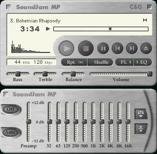
remember this? i thought this looked jammy! [that means groovy, zimphire]
[ignore the equalizer]