

Thread
I want to do this...
Find a mini paperclip if you do. I had to use one as a probe extender to get into the socket end of the adapters 
Ok, I have my wax mold of the 605's pout. Unfortunately, the floppy gap itself (the distance between the top and bottom horizontal lines of the floppy hole) is about a millimeter taller on the 605 than on the Classic. I'll need to do some carving to get it to slide in properly. Question is: should I shave the wax mold, or the Classic.
Sorry about the image sizes. They're straight off my phone.
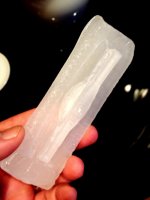
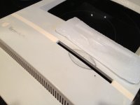
Sorry about the image sizes. They're straight off my phone.
Both! Scrape the flats of the wax mold to fit and then file the excess putty out of the slot after molding it to clean up the lines.
Alternately: file the existing Classic slot to match the 605's slot and then do the casting as planned, that'd be more true to the original concept.
Alternately: file the existing Classic slot to match the 605's slot and then do the casting as planned, that'd be more true to the original concept.
As though a billion OOMs cried out as one...
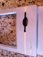
Fitted the wax negative pout hard against the bottom un-shaved edge with duct tape and filled in all the cracks and crevasses with latex wood putty. This should give me a good base for filling and sanding the new pout.
Now we test my patience. I hope I can wait until after work Monday for everything to set all the way up. Then I'll take a hair dryer to the wax to loosen it up and see how much touch up will be necessary.
I was worried that the angle and curve of the 605's pout negative wouldn't closely enough match the Classic II's face, but once it was in place it matched up beautifully. The curve is almost exactly the same and the distance inside from the front face to the front of the FDD mechanism is very very close enough.
If this doesn't work I'll be very disappointed, but I can always try the original graft-from-the-605 idea.
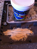
Now we test my patience. I hope I can wait until after work Monday for everything to set all the way up. Then I'll take a hair dryer to the wax to loosen it up and see how much touch up will be necessary.
I was worried that the angle and curve of the 605's pout negative wouldn't closely enough match the Classic II's face, but once it was in place it matched up beautifully. The curve is almost exactly the same and the distance inside from the front face to the front of the FDD mechanism is very very close enough.
If this doesn't work I'll be very disappointed, but I can always try the original graft-from-the-605 idea.

I know it wouldn't be authentic, but I think a silverish gray color would make this thing look awesome when its all smoothed out.
Oh, wow. That's certainly handy. Is there one for the beige?
Found it. 
http://apple2history.org/2012/02/10/pantone-453/
Pantone Color 453
I never thought to look up the exact color.
http://apple2history.org/2012/02/10/pantone-453/
Pantone Color 453
I never thought to look up the exact color.
It ought to work just fine, but I'm very surprised you covered the indentedslot portion of your wax negative over with the putty, now it seems like you have a lot more work to do. :?:
@ oP, I knew there was a Pantone number for beige, but I was surprised that there wasn't a spec for the Platinum. Apple has always been very anal retentive about color matching for print.
Lowe's is partnering with Pantone for mixing paint colors.

While we're on the subject of handy Apple stuff...
The font that all beige & platinum Macs use for their silk-screened names, "Macintosh Plus," or "Macintosh Quadra 605," or whatever text appears near the rainbow apple logo, is Apple Garamond (Adobe Garamond will do) at a 70% font set-width.
You can do this in Photoshop (or better yet in Illustrator or inDesign): with the type tool, type your word then highlight it; go to the character pane ("Window" menu -> "Character") and change the set width (looks like a fat T above a two-pointed arrow) from 100% to 70%.
What you typed, and whatever you type until you change the settings again, will look like the font on a Mac!
The font size ranges (on Macs I have handy) from 12 point on the Performa 460 ("Macintosh" is in 14 point), to 16 point on the SE, to 18 point on the Classic.
The font that all beige & platinum Macs use for their silk-screened names, "Macintosh Plus," or "Macintosh Quadra 605," or whatever text appears near the rainbow apple logo, is Apple Garamond (Adobe Garamond will do) at a 70% font set-width.
You can do this in Photoshop (or better yet in Illustrator or inDesign): with the type tool, type your word then highlight it; go to the character pane ("Window" menu -> "Character") and change the set width (looks like a fat T above a two-pointed arrow) from 100% to 70%.
What you typed, and whatever you type until you change the settings again, will look like the font on a Mac!
The font size ranges (on Macs I have handy) from 12 point on the Performa 460 ("Macintosh" is in 14 point), to 16 point on the SE, to 18 point on the Classic.
jt: Not sure what you mean... The cooling wax pulled in on the duct tape that was stopping the back of the opening, creating a concave space inside the lines of the opening. The gray/black outline you see is the wax edge with a little putty contained entirely in the wax. It should slide out with the mold, leaving a nice open pout. Is that the indented slot you meant? What I'm more concerned about is clearance with the metal frame. I hope I don't have to do too much filing to get everything to fit.
Good to hear that I can walk into Lowes and buy a "tester" can of PMS 420/421!
My ideas for adding the hard tooled texture:
- Brush coat of paint on, let become tacky, press very fine-grained sand paper against surfaces (the "hard tool texture" results from the sand mold the metal tool is made in, so this should be close.)
- Spray light coat of paint on, dust with talcum powder, spray with a few more coats (this will result in a raised, rather than indented texture, but it should let the light reflect off the different surfaces similarly).
I'll test both to see if I can get it right... worse comes to worst, I'll just leave it smooth with an eggshell finish.
Good to hear that I can walk into Lowes and buy a "tester" can of PMS 420/421!
My ideas for adding the hard tooled texture:
- Brush coat of paint on, let become tacky, press very fine-grained sand paper against surfaces (the "hard tool texture" results from the sand mold the metal tool is made in, so this should be close.)
- Spray light coat of paint on, dust with talcum powder, spray with a few more coats (this will result in a raised, rather than indented texture, but it should let the light reflect off the different surfaces similarly).
I'll test both to see if I can get it right... worse comes to worst, I'll just leave it smooth with an eggshell finish.
I'm not sure if Pantone has rolled out in any stores yet, but soon.
I had them computer match one of my Q700 lids for the High Heel Platform Feets hack of the trio.
I had them computer match one of my Q700 lids for the High Heel Platform Feets hack of the trio.
Photoshop time wasting...
I made up faceplates for Classic III, Performa 225, P.280, P.300, P.375 (I couldn't decide on a Performa Number), Quadra 305, and SE/40. They all look okay, but Quadra Classic is my favorite.
I decided on M4176 for the model number, the Classic II was M4150 and the 475/605 was M1476, so it's kind of a combo of the two, uses all the same numerals as the 475/605.
I'll have to see if I can get these printed on the right weight of vinyl sticker. The backplate will go over the original embossed Classic II backplate. I'll have to make a SN sticker too.
I'm thinking the sticker on the front will work best, if I can create a little indent for it, that would rock, but I'm not convinced my skills are up to it. I'm also thinking I might print it backwards on iron-on paper and see how that transfers.

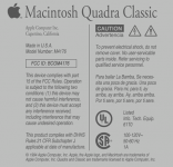
I made up faceplates for Classic III, Performa 225, P.280, P.300, P.375 (I couldn't decide on a Performa Number), Quadra 305, and SE/40. They all look okay, but Quadra Classic is my favorite.
I decided on M4176 for the model number, the Classic II was M4150 and the 475/605 was M1476, so it's kind of a combo of the two, uses all the same numerals as the 475/605.
I'll have to see if I can get these printed on the right weight of vinyl sticker. The backplate will go over the original embossed Classic II backplate. I'll have to make a SN sticker too.
I'm thinking the sticker on the front will work best, if I can create a little indent for it, that would rock, but I'm not convinced my skills are up to it. I'm also thinking I might print it backwards on iron-on paper and see how that transfers.
Rock on
Semi-disappointing result. Turns out I should've used a lower viscosity filler, as there were some unfilled gaps in the putty-pout. I also over-estimated the ability of the putty to dry when sealed against wax.
Not terribly discouraged though, I filled in the gaps and reinserted the wax negative. We'll see if a week or 10 days will be enough to dry the new putty in there. If not, I'll look into starting over another way.
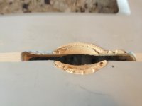
Not terribly discouraged though, I filled in the gaps and reinserted the wax negative. We'll see if a week or 10 days will be enough to dry the new putty in there. If not, I'll look into starting over another way.
Not all that bad for a first run. Take a peek at this month's Fine Homebuilding, the cover article is on casting concrete countertops. They use a multi-step process, the first application being a thinned skim coat on the well waxed form, using a gravity fed spray gun that's normally used for applying that horrible popcorn finish to ceilings.
I'll bet starting with a very thin coat and building the filler up afterwards in like manner might give you the effect you'd like if you need to try a second run at it.
It looks to me like you can probably salvage what you've got though.
I'll bet starting with a very thin coat and building the filler up afterwards in like manner might give you the effect you'd like if you need to try a second run at it.
It looks to me like you can probably salvage what you've got though.
If you make printable stickers I would lovea set. I have a couple of wreck classic fronts well worth doing this to.
I'll see what the Kinkos down the street can do for me. I'd love to see some other Quadra Classics out there.
I've refined and cleaned up both designs since that post, done some measuring and fiddling to get things closer to what's on the back of the Classic II. I put the comma in "Apple Computer, Inc.", changed "Made" to "Assembled in U.S.A", and messed with line-spacing and stuff.
I can put any text you want in there; it's a completely from scratch PhotoShop document. You might notice some liberdad I took with the text above.
Why not use water decals for the front face text? We all remember how to use these from building model airplanes. They make printable sheets to DIY with your laser printer.
Brilliant! I'll look into it!
Thats a fantastic idea!! great thinking!!
If your changing to the quadra floppy drive isnt it just slightly higher than the non door floppy?. i noticed this difference between my quadra and the LC with the classic like indent. When cover was put on it would not eject the disk, it would hit the edge of the hole. Just wondering as it seems you left the hole in the same place.
I thought having the perfectly square/horizontal pout was easier to accomplish by using some of the original hole. I will adjust/adapt the floppy sled as necessary. There is still a gap below the FDD, so I can adjust it up or down as necessary.
Just double-checked. The auto-inject (Classic II) FDD when waiting to accept a floppy (empty/up), rides about 3mm higher than an empty manual-inject (Quadra Classic). So If I was going to move the slot, I would've wanted to move it down a few millimeters.
From my experience with the ZipCC, I'll use some screws as adjustable feet on the bottom of the FDD (it has four mounting holes on the bottom) to get the vertical just-right. Then I'll only need to use the sled to secure it horizontally, so the FDD won't slide left, right, or in.
From my experience with the ZipCC, I'll use some screws as adjustable feet on the bottom of the FDD (it has four mounting holes on the bottom) to get the vertical just-right. Then I'll only need to use the sled to secure it horizontally, so the FDD won't slide left, right, or in.
Looks like this one is just going to take some patience. Like you said, probably a good idea to just let it sit in the mold for a week just to be sure.
Yup. Luckily I have some Easter traveling to do, so I won't be able to mess with it until next week. I might wait until later in April some time, there's plenty of other aspects of the project to keep me entertained.
I tried all my switchless video adapters with the 605/33 logicboard.

This unlabeled generic adapter I diagrammed earlier in the thread offers two resolutions in the "Monitors" control panel's "Options..." dialog box: 640x480@60Hz and 800x600@56Hz!
The "Adapter 21" one offered the Apple list of rezzes: 640x480@67Hz, 832x624@75Hz, 1024x768@75Hz, 1152x870@75Hz (I'm doing this from memory, my notes are at work, so some of the Hz figures are questionable on this one).
Another adapter I have labeled "640x480, 832x624, 1024x768" offers those rezzes at the higher Hertzes of the Adapter 21.
I tried the 800x600@56Hz on the 10" color VGA CRT I have, and it looked great. The grayscale monitor is in pieces, waiting for the facelift on the case to be finished, so I couldn't try it with that, but I like that 800x600 is a working option after all! I definitely want to wire the video according to the diagram for my unlabeled generic adapter so I can choose from VGA and SVGA!
Next I'll try some combinations on the switchy adapters, and see if I can replicate the 640@60 and 800@56 rezzes to double check the diagram.
This unlabeled generic adapter I diagrammed earlier in the thread offers two resolutions in the "Monitors" control panel's "Options..." dialog box: 640x480@60Hz and 800x600@56Hz!
The "Adapter 21" one offered the Apple list of rezzes: 640x480@67Hz, 832x624@75Hz, 1024x768@75Hz, 1152x870@75Hz (I'm doing this from memory, my notes are at work, so some of the Hz figures are questionable on this one).
Another adapter I have labeled "640x480, 832x624, 1024x768" offers those rezzes at the higher Hertzes of the Adapter 21.
I tried the 800x600@56Hz on the 10" color VGA CRT I have, and it looked great. The grayscale monitor is in pieces, waiting for the facelift on the case to be finished, so I couldn't try it with that, but I like that 800x600 is a working option after all! I definitely want to wire the video according to the diagram for my unlabeled generic adapter so I can choose from VGA and SVGA!
Next I'll try some combinations on the switchy adapters, and see if I can replicate the 640@60 and 800@56 rezzes to double check the diagram.
Screenshot of above mentioned SVGA on a Q605
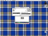
A project doesn't really start until you name the hard drive after it ;D
I kind of want to smooth out my SE front in a similar fashion, but it will be 100% flat.(therefore, not as cool)
I kind of want to smooth out my SE front in a similar fashion, but it will be 100% flat.(therefore, not as cool)